

Do you look on Pinterest for Anchor Chart ideas and give up at the thought that your Anchor Chart could never look that amazing? It actually doesn’t have to be that difficult to make an amazing Anchor Chart that you and your students will actually enjoy creating and looking at. I have a few simple hacks and tips that will make creating Anchor Charts less daunting.
First, you may want to consider the purpose of your Anchor Chart and how much time you want to invest in it. If it’s an Anchor Chart that you will have displayed all year, then go ahead take your time with it and get fancy! However, if it’s something that will be up only for a brief period or the duration of a mini-unit, then you may just want to keep it simple.
Second, you need to consider how much involvement your students will have with the Anchor Chart. I firmly believe that Anchor Charts are more meaningful to students when students contribute to the content of the Anchor Chart. After all, the Anchor Charts are for them. It’s a good idea to leave some space for student ideas and contributions. I usually create the headings, borders, frames, and pictures before using it in my lesson. During the lesson I like to have students tell me their ideas or contributions and then write their responses directly on the Anchor Charts. Of course, that means most of my Anchor Charts will be trashed at the end of each year, but it’s all about student ownership and engagement, so it’s worth the effort.
To dress up your Anchor Chart there are five components that you can use for any Anchor Chart you create; Title, border, frames, lettering, and pictures.

Titles: Your title of your Anchor Chart should be considerably larger than the rest of your lettering in the chart. You can really have fun with your Titles and make them as fancy and colorful as you like; use multi-colors, outline the letters, make “glowing letters”, or even make a drop shadow for your letters. 
Subtitles: for your subtitles or sub-headers you can use some easy lettering tips to dress it up. Of course there are tons of lettering options limited only to your imagination, but here i have outlined just a couple. It’s a good idea to have a couple go to lettering styles that you can use. The more you use them the faster you will be at creating beautiful letters. Check out the image below for some quick lettering hacks.

Borders: Borders are the easiest way to fancy up those Anchor charts. You don’t have to be artistic at all to make a cute border. Here a few that will take no time at all to create.

Frames: Use frames to go around your sub-topics or student contributions. Frames can be simple or as fancy as you like.

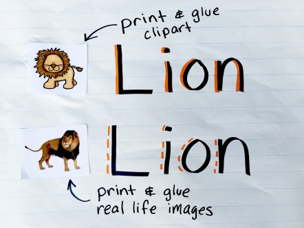
Pictures: Once again, you don’t have to be artistic to have awesome pictures in your Anchor Charts. An easy peasy solution is to print, cut, and paste clipart or real photos. You could also use magazine or newspaper cutouts.
I hope these hacks and tips will help you create awesome Anchor Charts for you students. I would love to see Anchor Charts you create. If you post something on social media, tag me so I can see your Amazing Anchor Charts!

This was an awesome, helpful post. I do a lot of lettering on signs and things for school but just these little tweaks are going to make my anchor charts looks wonderful!
LikeLike
Love your tips & tricks. If you laminated your templates, you could add student work and erase it for the next year.
LikeLike